// npm install framer-motion @phosphor-icons/react

Root element: className="relative flex min-h-screen w-full items-center justify-end overflow-hidden bg-[#1A1A19] pb-8"
The source ships h-full because AI Canvas renders it inside a sized preview frame. A standalone paste needs min-h-screen, or an ancestor with a real height, or the root collapses and takes its absolute layers with it.

Before building, verify your project has the following setup:
- React / Next.js
- TypeScript
- Tailwind CSS v4

If any are missing, set up via the shadcn CLI:
  npx shadcn@latest init

---

Create a React client component named `GlassDock`, a macOS-style frosted glass dock with distance-based magnification, notification-style tinted icon badges, and frosted tooltips.

Write this as a single self-contained React client component. Inline everything. Do not extract helper hooks, utility functions, or separate files. 'use client' at the top. No 'any' types.

Background image (absolute inset-0 object-cover opacity-60 pointer-events-none):
`https://ik.imagekit.io/aitoolkit/bg%20images/Ethereal%20Orange%20Flower%201%20(1).png?updatedAt=1775223702866`

Constants:
- ICON_SIZE = 44
- MAG_RANGE = 120
- MAG_SCALE = 1.55

DOCK_ITEMS (icon, label, color):
Sun #FFBE0B "Energy" · Heart #FF5C8A "Love" · MusicNote #FF7B54 "Joy" · Coffee #C9A96E "Comfort" · Leaf #06D6A0 "Nature" · Star #FFBE0B "Dreams" · Moon #B388FF "Rest" · Flame #FF5C8A "Passion" · Cloud #3A86FF "Peace".

Root: div relative flex h-full w-full items-center justify-end overflow-hidden bg-[#1A1A19] pb-8. Background <img>.

GlassDock: const mouseX = useMotionValue(-200), plus openItems as a Set<string>. toggleItem(label) clones the Set and adds or removes that label. Dock motion.div:
- initial {y:50}, animate {y:0}, transition {type:'spring', stiffness:180, damping:20}
- onMouseMove: mouseX.set(e.clientX); onMouseLeave: mouseX.set(-200)
- className "relative isolate mx-auto flex items-end gap-2 rounded-3xl px-4 pb-3 pt-3"
- style: background 'rgba(255,255,255,0.06)', border '1px solid rgba(255,255,255,0.1)', boxShadow '0 8px 40px rgba(0,0,0,0.4), inset 0 1px 0 rgba(255,255,255,0.08)'
- Separate blur layer: pointer-events-none absolute inset-0 z-[-1] rounded-3xl, style { backdropFilter:'blur(24px) saturate(1.8)', WebkitBackdropFilter same }. Non-animating layer so magnification frames don't re-blur.
- Map DOCK_ITEMS to DockItem, passing isOpen={openItems.has(item.label)} and onToggle={() => toggleItem(item.label)}.

DockItem props: { icon: Icon, color, label, mouseX, index, isOpen, onToggle }.
- ref = useRef<HTMLButtonElement>(null)
- Keep touch-tooltip state and a timeout ref, clear the timeout on unmount, and show the tooltip for 1200ms after a touch pointerup.
- distance = useTransform(mouseX, mx => { el=ref.current; if(!el||mx<0) return 200; const rect=el.getBoundingClientRect(); const center=rect.left+rect.width/2; return Math.abs(mx-center) })
- rawSize = useTransform(distance, [0, MAG_RANGE], [ICON_SIZE*MAG_SCALE, ICON_SIZE])
- size = useSpring(rawSize, { stiffness:300, damping:22, mass:0.5 })
- y = useTransform(size, [ICON_SIZE, ICON_SIZE*MAG_SCALE], [0, -12])

Outer motion.button: type="button", aria-label={label}, aria-pressed={isOpen}, onClick={onToggle}, className "group relative flex cursor-pointer appearance-none flex-col items-center border-0 bg-transparent p-0 outline-none", entrance initial {opacity:0, y:20} animate {opacity:1, y:0}, transition {type:'spring', stiffness:200, damping:18, delay: index*0.04}.

Tooltip motion.div: className "pointer-events-none absolute -top-10 rounded-lg px-3 py-1.5 text-xs font-medium text-white/90 opacity-0 group-hover:opacity-100 group-focus-visible:opacity-100", with opacity-100 also applied while the touch tooltip state is visible. Style background 'rgba(255,255,255,0.1)', backdropFilter 'blur(16px)', border '1px solid rgba(255,255,255,0.1)', transition 'opacity 0.15s'.

Icon badge motion.div (notification-style tinted, NOT gradient, NOT gloss, NOT squircle): style {width:size, height:size, y, background: `${color}18`, border: `1px solid ${color}22`, borderRadius:12}, whileTap {scale:0.82}, className "relative flex items-center justify-center group-focus-visible:outline group-focus-visible:outline-2 group-focus-visible:outline-offset-2 group-focus-visible:outline-[rgba(255,255,255,0.6)]". Inside: <Icon size={22} weight="regular" style={{color}} />. Under it, AnimatePresence springs a 4px dot in the item color from opacity/scale 0 to 1 when isOpen, positioned at bottom -6 and left calc(50% - 2px), with stiffness 500 and damping 30.

Imports: useEffect, useRef, useState from react; AnimatePresence, motion, useMotionValue, useSpring, useTransform from framer-motion; Sun, Heart, MusicNote, Coffee, Leaf, Star, Moon, Flame, Cloud from @phosphor-icons/react (all weight="regular").

## Typography
- Font: project default sans-serif
- Sizes: 12px
- Weights: 500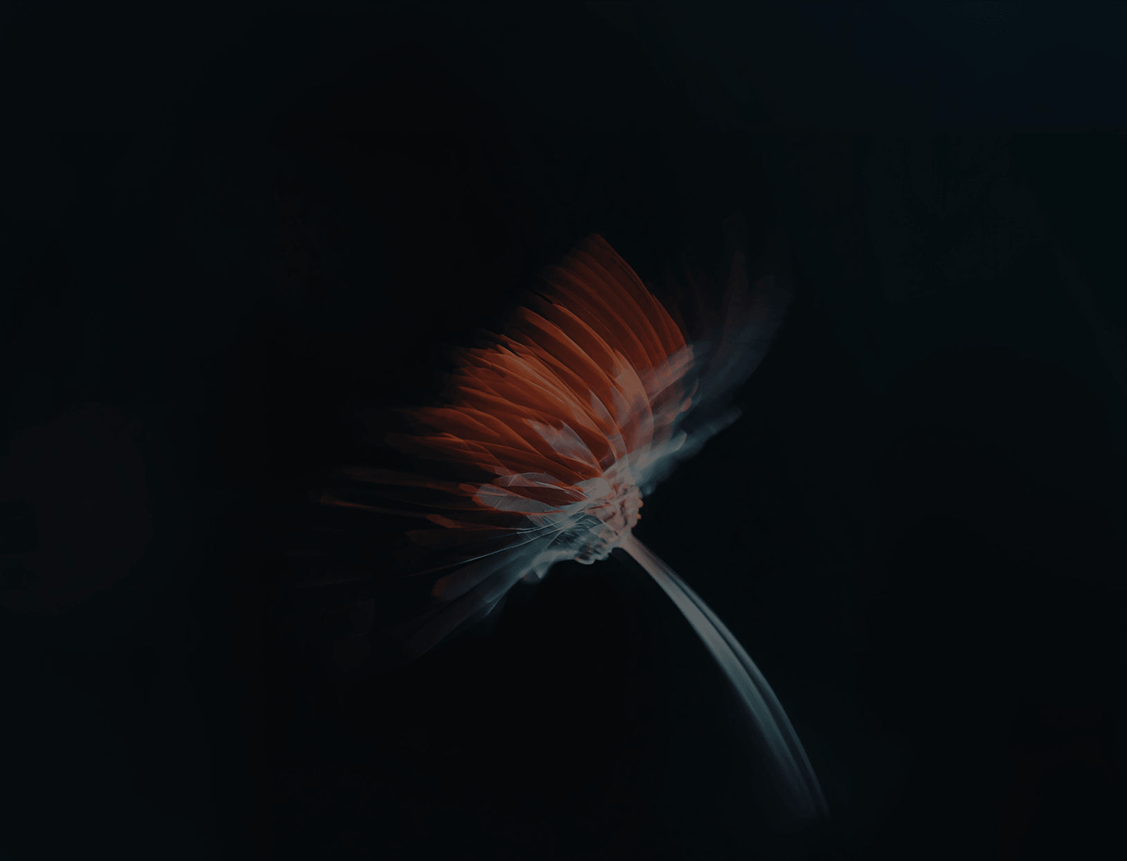
 AI Canvas