// npm install framer-motion @phosphor-icons/react

Root element: className="relative flex min-h-screen w-full items-center justify-center overflow-hidden bg-[#1A1A19]"
The source ships h-full because AI Canvas renders it inside a sized preview frame. A standalone paste needs min-h-screen, or an ancestor with a real height, or the root collapses and takes its absolute layers with it.

Before building, verify your project has the following setup:
- React / Next.js
- TypeScript
- Tailwind CSS v4

If any are missing, set up via the shadcn CLI:
  npx shadcn@latest init

---

Create a React client component named `GlassModal`, a frosted-glass upgrade modal centered on a dark scene, with staggered entrance, warm amber accents, and an animated close button.

Write this as a single self-contained React client component. Inline everything. Do not extract helper hooks, utility functions, or separate files. 'use client' at the top. No 'any' types.

Background image (absolute inset-0 object-cover opacity-60 pointer-events-none):
`https://ik.imagekit.io/aitoolkit/bg%20images/Ethereal%20Orange%20Flower%201%20(1).png?updatedAt=1775223702866`

Root: div relative flex min-h-screen w-full items-center justify-center overflow-hidden bg-[#1A1A19]. The source has h-full there because AI Canvas renders it inside a sized preview frame; a standalone paste needs min-h-screen, or an ancestor with a real height.

State, open and closed:
- const [open, setOpen] = useState(true); const triggerRef = useRef<HTMLButtonElement>(null); const closeRef = useRef<HTMLButtonElement>(null); const focusOnOpen = useRef(false); function close() { setOpen(false) }
- useEffect(() => { if (!open) triggerRef.current?.focus(); else if (focusOnOpen.current) { closeRef.current?.focus(); focusOnOpen.current = false } }, [open]), so when the modal closes, focus moves to the View Upgrade trigger, and when the trigger reopens it, focus moves to the Close (X) button. focusOnOpen starts false, so the modal that is open on first load never steals focus.
- After the background image, one <AnimatePresence> holds {!open && <View Upgrade trigger key="trigger">} then {open && <Modal card key="card">}. Both keys are required: without them the two children share the same empty key, AnimatePresence treats close and reopen as one child changing type, and neither exit plays.

View Upgrade trigger (motion.button), shown only while closed: key="trigger", ref={triggerRef}, type="button", onClick={() => { focusOnOpen.current = true; setOpen(true) }}, text "View Upgrade", className "absolute cursor-pointer rounded-full px-5 py-3 text-sm font-medium text-white/60"
- absolute, not relative: while the card exits and the trigger enters (or the reverse), both are mounted at once (the keys make this happen). absolute takes the trigger out of the root's flex row, so it sits centred over the same spot instead of sharing the row with the card and shoving it sideways.
- style: background 'rgba(255,255,255,0.06)', border '1px solid rgba(255,255,255,0.1)', backdropFilter 'blur(40px) saturate(1.8)' + WebkitBackdropFilter.
- initial {opacity:0, scale:0.9}, animate {opacity:1, scale:1}, exit {opacity:0, scale:0.9}
- whileHover {scale:1.04, background:'rgba(255,255,255,0.1)'}, whileTap {scale:0.96}, transition {duration:0.25, ease:[0.25,0.1,0.25,1]}
- Clicking it reopens the modal, which plays its normal entrance again.

Modal card (motion.div, key="card"):
- initial {scale:0.9, y:16}, animate {scale:1, y:0}, transition {type:'spring', stiffness:350, damping:28}
- exit {scale:0.9, y:16, opacity:0}, played when open turns false (needs key="card", see AnimatePresence above).
- className "relative isolate w-[min(340px,calc(100vw-2rem))] overflow-hidden rounded-3xl"
- style: background 'rgba(255,255,255,0.08)', border '1px solid rgba(255,255,255,0.12)', boxShadow '0 24px 80px rgba(0,0,0,0.5), 0 0 0 1px rgba(255,255,255,0.05), inset 0 1px 0 rgba(255,255,255,0.1)'
- Separate blur layer (non-animating): pointer-events-none absolute inset-0 z-[-1] rounded-3xl, backdropFilter 'blur(40px) saturate(1.8)' + WebkitBackdropFilter.
- Top highlight: absolute left-8 right-8 top-0 h-[1px], background 'linear-gradient(90deg, transparent, rgba(255,255,255,0.25), transparent)'.

Close button (motion.button): className "absolute right-4 top-4 z-10 flex h-8 w-8 cursor-pointer items-center justify-center rounded-full", bg 'rgba(255,255,255,0.08)', border '1px solid rgba(255,255,255,0.08)'.
- whileHover { scale:1.15, rotate:90 }
- whileTap {scale:0.9}, transition {duration:0.2, ease:[0.25,0.1,0.25,1]}
- X icon size={14} weight="regular" className="text-white/60"
- ref={closeRef}, type="button", aria-label="Close", onClick={close}

Content container: flex flex-col items-center px-8 pb-8 pt-10.

1) Icon badge (motion.div), notification-style tinted: className "mb-5 flex h-16 w-16 items-center justify-center rounded-xl", style background '#FFA03218' border '1px solid #FFA03222'. Entrance: initial {scale:0, rotate:-20}, animate {scale:1, rotate:0}, transition {type:'spring', stiffness:300, damping:18, delay:0.15}. Child: <ShieldCheck size={28} weight="regular" style={{color:'#FFA032'}} />.

2) Heading motion.h2: "Upgrade to Pro", className "mb-2 text-lg font-semibold text-white/90", initial {opacity:0, y:8} animate {opacity:1, y:0} transition {delay:0.2}.

3) Description motion.p: "Unlock premium components, priority support, and early access to new features." className "mb-6 text-center text-sm leading-relaxed text-white/40", initial {opacity:0, y:8}, transition {delay:0.25}.

4) Features motion.div wrapper initial {opacity:0} animate {opacity:1} transition {delay:0.3} className "mb-6 flex w-full flex-col gap-3". Items ['Unlimited components', 'Source code access', 'Priority support']. Each motion.div: initial {opacity:0, x:-12}, animate {opacity:1, x:0}, transition {delay:0.35 + i*0.08}, className "flex items-center gap-3". Badge: h-5 w-5 rounded-full flex centered, bg 'rgba(255,155,50,0.18)'. Check icon size={10} weight="regular" color 'rgba(255,155,50,1)'. Label: span text-sm text-white/60.

5) Buttons flex flex-col gap-2 w-full.
Primary motion.button ("Upgrade Now") className "w-full cursor-pointer rounded-full py-3 text-sm font-semibold text-white":
- style: background 'linear-gradient(135deg, rgba(255,160,50,0.75), rgba(220,60,40,0.6))', border '1px solid rgba(255,180,80,0.25)', boxShadow '0 2px 16px rgba(220,80,30,0.4)'
- whileHover {scale:1.04, background:'linear-gradient(135deg, rgba(255,180,80,0.9), rgba(235,75,45,0.8))', boxShadow:'0 4px 24px rgba(220,80,30,0.6)'}
- whileTap {scale:0.96}, transition {duration:0.25, ease:[0.25,0.1,0.25,1]}
- type="button", onClick={close}: closes the modal, same as X.
Ghost motion.button ("Maybe Later") className "w-full cursor-pointer rounded-full py-3 text-sm font-medium text-white/50":
- style: bg 'rgba(255,255,255,0.06)', border '1px solid rgba(255,255,255,0.1)'
- whileHover {scale:1.04, background:'rgba(255,255,255,0.1)'}, whileTap {scale:0.96}, same ease.
- type="button", onClick={close}: closes the modal, same as X.

Imports: useEffect, useRef, useState from react; AnimatePresence, motion from framer-motion; X, Check, ShieldCheck from @phosphor-icons/react (weight="regular").

## Typography
- Font: project default sans-serif
- Sizes: 14px, 18px
- Weights: 500, 600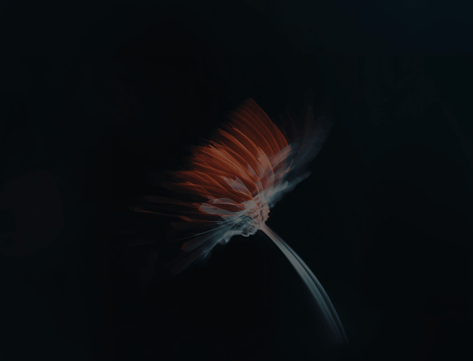
 AI Canvas